I mostly use LinkedIn when I’m looking for a job. When I open it, the page shows me jobs, people, and companies that are close to what I already look at. I never really thought about why until this week’s reading.
Bucher and Helmond (2018) explain that affordances are about what a design makes people think they can do. They mention and talk about what the Norman’s idea that good design should make the possible actions visible to the user. But on social media, not everything is visible. Bucher and Helmond say that algorithms can act as hidden affordances, shaping what we see without us noticing the influence.
For me, recommendations are the biggest example. Bucher and Helmond also say that platforms personalize what each user sees, and that our clicks and likes feed back into the system. That means the more I engage with tech jobs and tech people, the more LinkedIn shows me the same thing. I’d guess about 80 to 90 percent of my connections are in computer science or tech, so my network already looks pretty narrow.
What does this keep out of view? People in other fields who could help me see my career in a new way. I wouldn’t even know they exist unless I went looking, because the feed doesn’t show them to me.
I haven’t tried changing this yet, but I want to.
How much control do we really have over our PLN if platforms are deciding who to recommend to us? Is this good for us, or should we be figuring out how to change this?
Looking at my own PLN honestly, it’s just the same people. It’s almost entirely CS and ML people, classmates, developers I follow, GitHub as a whole. I guess that it’s just easier to build a network around people who already think the way you do. But I think easier doesn’t mean better, though.
The clearest example of this actually mattering was during my co-op at the National Research Council. I was building an ML pipeline for retrieving astronomical images, a technical problem from where I sat. But the people actually using it were astronomers, and the questions and the functionality they wanted and cared about were completely different from mine. I was aiming for the retrieval accuracy and speed. They cared about whether the tool actually fit their research workflow, and what a false positive actually cost them in wasted hours. I hadn’t built the wrong thing, but I’d been solving a narrower version of the problem than the one that actually existed, and that gap only became visible because people outside my field were in the room.
That is close to what Margaret Heffernan’s TED Talk, “Dare to Disagree”, is about, where she describes a researcher who deliberately worked with someone who actively challenged her conclusions, and how that friction led to a real breakthrough rather than slowing her down. Having a diverse PLN and having an inclusive one aren’t the same thing. I could follow people from completely different fields and still never learn anything from them if I don’t actually engage with what they’re saying, or if nobody in my network is actually willing to push back or give me a different perspective on how I think.
Right now my PLN is comfortable, mostly people who already validate the way I think about problems. That’s exactly the setup that could let me miss something obvious, the way I almost did on that co-op project.
I have a question for anyone who has actually diversified their PLN on purpose: what did that look like to you- direct conversations, working on something together, or something else, Excited to hear?
Making this map was a good excuse to actually think about how I use each platform.
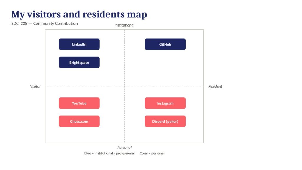
LinkedIn and Brightspace both landed institutional-visitor. I use both because school or the career stuff requires it, but I’m not really building a presence on either one so I check in, do what I need, and leave. GitHub is the one platform where I’m actually institutional-resident. It’s not just a place I visit for a task, it’s the current record of what I’ve built, and other people can look through it the same way I look through other students’ or researchers’ repos. That’s the closest thing I have to an active professional network right now.
On the personal side, YouTube and Chess.com are visitor platforms for me; I use them constantly, but almost entirely to consume- ML tutorials, chess puzzles, whatever- without any presence of my own there. Instagram and my poker group chat on Discord are where I’m actually a resident, that’s where people know me, where I’m participating.
That actually makes me a little more aware of the LinkedIn gap. It’s the one platform meant to build a professional network, and I’m currently just visiting it, not participating in it. If I want it to actually function as part of my PLN instead of just an online resume, I’d need to start acting more like a resident there, engaging with posts, following people in ML and AI, and the other influencers in this space not just keeping a profile up to date; this can eventually help me land something in the future.
My question for the group: for the platform you use the least intentionally, is that because it doesn’t fit how you like to build a network, or just because you haven’t gotten around to using it that way yet? I’m not sure which one it is for me with LinkedIn.
Digital Identity: The CS Student Behind the LinkedIn Profile
When I think about my digital identity, I see a professional side, LinkedIn and GitHub, and a personal side, everything else. On LinkedIn, I’m careful and very professional, for example a co-op experience at the National Research Council of Canada, or research work I did in one of the labs at UVic, projects I’ve built. GitHub is honestly the more interesting one to me, because it’s not really a resume; it’s the evidence for your resume. Anyone can say they know machine learning, but a repo with actual commits and working code says it in a way a bullet point can’t.
My personal accounts are a completely different story. That’s where you’d find me talking about badminton, jiu-jitsu, the fact that I placed top 3 at a UVic poker tournament, or clips of me playing piano at a talent show years ago. None of that is written to impress anyone. It’s just what I’m actually doing with my time outside of school.
The interesting part is that these two versions of me aren’t as separate as I’d like to believe. danah boyd’s idea of context collapse describes this well. For example, I post something for one audience (friends, a poker group chat, my badminton club) with zero thought about who else might eventually see it. But a future employer scrolling through isn’t going to read a poker result the way my friends do; they might read it as a signal about risk tolerance, or just be curious, or not care at all. I don’t get to choose which interpretation lands. That’s the part of digital identity that feels less like something I control and more like something that happens to me after the fact.
This connects to how I think about my personal learning network too. Right now my PLN is mostly informal: classmates I actually talk to about assignments, a couple of people I follow because they post real technical breakdowns instead of surface-level content, and GitHub itself functions like a network since I can see what other students and researchers are actually building. I haven’t been very intentional about it; it’s grown more by accident than by design, which is probably true of my digital identity in general. I’ve been more focused on what I put out.
So my question for the other is this: for those of you who also have a “technical evidence” platform like GitHub, a portfolio, or something similar, do you think of that as part of your professional identity, your PLN, or both?
Flight Path: Social Media and Personalized Learning
I’m coming into EDCI 338 from a pretty different starting point than most people in this course. I’m a fourth-year computer science student at UVic, and most of my background is on the technical side for example, machine learning, building software, doing research work rather than studying education directly. So when I think about “personalized learning,” my thinking is about it the way I’d think about a recommendation system or an adaptive algorithm, something that adjusts to a person’s inputs and gets better over time. I don’t have a background in pedagogy or teaching, but I do have a lot of experience with how technical systems shape what information reaches someone and when.
My relationship with social media is mostly personal. I use it the way most people my age do, which is like to keep up with people, follow things I’m interested in, and occasionally get sucked into something I didn’t mean to spend an hour on. I haven’t really used social media as a learning tool before. That’s actually part of why I signed up for this course. I wanted to see personalized learning and digital literacy from the other side, as something you can study and design intentionally, instead of something that just happens to you while you’re scrolling.
What I want to get out of this course is less about a specific final project and more about a shift in how I think. I want to walk away actually able to build a personal learning network on purpose. I’m also interested in the privacy and data ownership side of things- Creative Commons, copyright, fair dealing- because that overlaps with questions I already think about from the tech side, just from a different viewing point. If there’s a specific thing I’d want to explore, it’s probably something around how AI-adjacent tools intersect with personalized learning, since that’s the space I already spend most of my time in.
The part of this course that looks the most scary to me is the “recognize the internet is not a neutral space” objective. My default lens on technology is usually functional: does it work, is it efficient, rather than critical: who does this actually serve and who does it leave out. I expect that shift in thinking will be the real challenge here, more than any specific technical skill. My plan for navigating the course is to mostly stay true about where my blind spots are instead of assuming my technical background makes me think that I am very qualified to skip that reflection, and to actually engage with the weekly discussions instead of treating them as just an assignment.
This course pushed me to think differently about how people learn through media. Looking back, every weekly assignment built on the last one, and I walked away with a much clearer sense of how design, storytelling, and technology all connect in education. Here’s how I met each learning outcome.
Contextualize how learning informs interactive and multimedia experiences
One of the biggest takeaways from this course was understanding that multimedia isn’t just about making things look nice, but it’s about how people actually process information. Through my multimedia story draft and the final multimedia story, I learned to think about the learner first. What are they seeing? What are they hearing? How do those two things work together? Planning a walk through a local park as a multimedia experience forced me to think about how the environment itself becomes a learning context, and how combining audio, visuals, and narration creates something better than any single format alone.
Apply multimedia design principles in planning your educational resources
Mayer’s multimedia learning principles were honestly the hardest part of this course for me to wrap my head around at first. Terms like modality, contiguity, and coherence felt new until I actually had to apply them to my own work. Once I started planning my multimedia story, things clicked. I realized contiguity means putting related words and images close together in time, and coherence means cutting anything that doesn’t add to the message. I also applied these principles in my data visualization post, where I matched each dataset to the chart type that best communicated its story, rather than just picking whatever looked cool.
Engage in design thinking to create multimedia learning projects
Design thinking showed up most clearly in how I approached the Daily Creates each week. I was making choices about format, tone, and what would actually communicate something meaningful. In my image week post, I learned that adding even a simple text overlay or audio layer to a photo changes how it lands for the viewer. That’s a design decision. In my video week post, I had to think about pacing, framing, and what to include versus what to cut.
Apply storytelling principles in creating effective learning opportunities
Storytelling was something I thought I understood before this course, but applying it to educational content made it more intentional. My multimedia story follows a clear beginning, a journey through the park, and a moment of reflection at the end. That structure wasn’t an accident. I learned that good educational content needs a narrative spine; it’s just information with no reason to care. My text week post also pushed me to tell answers to creative prompts from TDC, which was a way to practice building a narrative quickly.
Describe and apply principles of effective interactive multimedia design
This outcome came together across the whole course, but it really clicked during the later weeks. Effective multimedia design means the format serves the content, not the other way around. In my audio week post, I learned that sound alone can carry a lot of meaning, but it works best when paired with context. In my data visualization post, I applied this by using bar charts for comparisons and a line chart for trends over time. Each choice was intentional and based on what would be clearest for someone seeing the data for the first time.
6. Generate a variety of prototype artifacts, including comics, videos, and web pages
Across the course, I created a range of artifacts, including written pieces, audio recordings, images with layered media, and videos. My video week post was probably the most challenging to produce because video editing was new to me, and getting the pacing right took a few tries. My image week post taught me how to layer simple elements onto a photo to add meaning, something that sounds basic but actually took some trial and error to get right.
7. Use GenAI appropriately as a tool to support creative activities
I used Claude throughout this course as a brainstorming tool. When I was stuck on how to frame a reflection or wasn’t sure how a Mayer principle connected to something I made, I’d talk it through with Claude to get unstuck. The ideas and the artifacts were mine, but having an AI to bounce things off of made the process faster and less frustrating. I think that’s what appropriate GenAI use looks like —it supports the thinking without replacing it. I made all the creative decisions, did all the recording and filming, and wrote the final versions of everything. Claude helped me get there.
Challenges I Faced
This course had a learning curve. Mayer’s principles were the hardest thing for me to internalize. I kept reading the definitions, but they didn’t feel real until I was actually planning a multimedia project and had to justify every design choice. Video editing was also a new territory. Getting footage, trimming it, and making it feel nice took way longer than I thought it would. And something as simple as adding audio or text to an image turned out to be trickier than expected. Figuring out the right tools and getting the output to look clean took real trial and error.
How This Applies to My Future
I’m studying computer science at UVic with a focus on AI and machine learning, and I’m planning to build systems that people actually interact with. This course made me think about the human side of that work in a way that pure CS coursework doesn’t always cover. If I’m building an AI tool or an educational platform, understanding how people process information, what makes content accessible, and how storytelling makes ideas stick. The principles I learned here aren’t just for education majors. They apply to any product or system designed for people to use and learn from. I’ll carry that with me into every project I work on.
References
Mayer, R. E. (2009). Multimedia learning (2nd ed.). Cambridge University Press.
Overview Every time you create an account online, your password goes through a series of invisible protections, or at least, it should. This learning resource explores what actually happens to passwords after you hit submit, why poor implementation leads to massive data breaches, and what both developers and everyday users can do about it.
As Bonneau et al. (2012) highlight, most authentication systems carry serious problems that users never see, and further found that weak password storage remains one of the leading causes of large-scale data breaches globally. This resource makes those technical realities approachable for anyone.
Learning Context and Learners
Who this is for: 15–20 learners across Canada, ranging from high school students (16+) to working professionals (up to 35). No programming or cybersecurity background is assumed, just basic internet use.
Lifestyle considerations: Some learners may be working full-time or managing family responsibilities. The module is fully asynchronous and completable in flexible 1–2 hour sessions with no live attendance required.
Accessibility: Content is written in plain language throughout, uses accessible color palettes for color blindness, and is broken into short, focused chunks to support learners with ADHD or English as an additional language.
Learning Theory: Constructivism
This resource is grounded in constructivism, the idea that learners build understanding through active experience rather than passive reception. Rather than simply explaining what hashing is, learners generate their own hashes, attempt to crack passwords, and analyze real breach scenarios.
This fits the topic well because password security only becomes meaningful when you feel it. Seeing a weak password crack in two seconds on CrackStation is more impactful than reading about it. Each subtopic moves from concept to interactive activity, so learners construct real understanding they can apply.
Learning Design: Inquiry-Based Learning
We use an inquiry-based design structured around essential questions. Each subtopic opens with a question that doesn’t have an obvious answer, pushing learners to explore before they’re given explanations.
This works here because the topic has natural curiosity hooks; most people are genuinely surprised that websites can’t retrieve their passwords, or that two people using the same password get different hashes. Inquiry lets that surprise do the teaching.
Designing for Diverse Learners (UDL + CAST)
Following Universal Design for Learning principles:
Multiple means of representation: Concepts are presented through written explanations, embedded YouTube videos, and interactive tool exploration so learners can engage in the format that works for them.
Multiple means of engagement: Activities range from low-stakes exploration (MD5 generator) to reflective writing to applied checklist creation. Learners choose how deeply to engage with each tool.
Multiple means of expression: Assessments include short-answer quizzes, plain-language written explanations, and a personal security checklist, giving learners multiple ways to demonstrate understanding.
Technology Rationale
WordPress hosts the resource because it’s free, mobile-friendly, and requires no software installation, which removes access barriers for learners across Canada.
H5P enables interactive quizzes embedded directly in the page so learners get immediate feedback without leaving the resource.
WordPress quizzes handle written submissions easily and work on any device.
MD5HashGenerator.com, CrackStation.net, and HaveIBeenPwned.com are free, browser-based tools that make abstract concepts easy with zero setup required.
Learning Objectives
By the end of this resource, learners will be able to:
Explain the concept of hashing, describe the step-by-step process of password storage, and identify why plain-text storage is dangerous.
Describe what salting is, explain how it prevents rainbow table attacks, and demonstrate why two identical passwords produce different hashes when salted.
Identify at least three common password attack methods, explain how each works, and connect attack success to poor storage practices.
Part 1: What Is Hashing and How Does It Work?
Essential Question: In what ways does the journey of a password from input to storage reveal the hidden complexity of everyday digital security?
Content
When you create an account, your password is run through a hash function, which is a one-way mathematical process that converts it into a fixed string of characters called a hash. “hello123” might become 482c811da5d5b4bc6d497ffa98491e38. The original password is never stored.
Key properties of hashing:
The same input always produces the same hash
Changing even one character completely changes the output
The process cannot be reversed because hashing is one-way
All hashes are the same fixed length regardless of input size
When you log in, your input is hashed and compared to the stored hash. If they match, you’re in. This is why secure websites force password resets rather than emailing you your password, because they genuinely cannot retrieve it.
Type in a short word like “hello” and generate its hash
Type in the same word with one character changed. Notice anything?
Try a very long sentence, and what do you notice about the hash length?
Try to reverse a hash back to the original text
Reflection questions to answer before moving on:
What stays consistent about hashes regardless of input?
Why does even a tiny change produce a completely different hash?
What does this tell you about why hashing is used for security?
Assessment 1: Short-Answer Quiz (H5P)
Four questions testing definitions and key properties of hashing.
Part 2: What Is Salting and Why Is It Necessary?
Essential Question: How does adding randomness to the hashing process fundamentally change the effectiveness of password protection?
Content
Hashing alone has a serious weakness. Attackers use rainbow tables, which are massive precomputed databases of common passwords and their hashes. If your password is “password123” and the hash is always the same, matching it takes seconds.
Salting fixes this. Before hashing, the system adds a unique random string (the salt) to your password. So even if you and a friend both use “password123,” your stored hashes look completely different. Rainbow tables become useless because the salt is unique per user.
Key points:
Salts are randomly generated and stored alongside the hash
The same password produces a different hash for every user
Modern algorithms like bcrypt handle salting automatically
MD5 and SHA-1 are outdated and should never be used for passwords
Watch:
Learning Activity 2: Crack the Hash Challenge (Experiment)
Write 100–150 words explaining salting as if you’re teaching a friend with zero technical background. Focus on: what salting is, why it matters, and what happens during a rainbow table attack.
Part 3: Common Password Attacks and Best Practices
Essential Question: What do data breaches reveal about the shared responsibility between developers and everyday users, and how can we apply best practices?
Content
Even with hashing and salting, poor implementation leaves users exposed. The three most common attack types:
Brute force — automated tools try every possible character combination until one works. Short or simple passwords fall fast.
Dictionary attacks — attackers run through lists of common words and passwords. “iloveyou” or “qwerty” are cracked almost instantly.
Rainbow table attacks — precomputed hash databases matched against stolen data. Defeated by proper salting, but still dangerous when developers skip it.
The root problem, as Bonneau et al. (2012) argue, is that many systems continue to use outdated algorithms such as MD5 without salting, leaving users exposed even when a breach occurs. NIST (2017) guidelines specifically recommend modern adaptive algorithms like bcrypt or Argon2.
What good looks like vs. bad:
Company A (Secure)
Company B (Insecure)
Uses bcrypt with unique salts
Uses MD5 with no salting
Breach exposes uncrackable hashes
Breach exposes millions of passwords within hours
Forces password reset after breach
Emails users their actual passwords
Learning Activity 3: Good Company vs. Bad Company (Analyze and Apply)
Read the two case studies above. Then:
Go to HaveIBeenPwned.com and check your email address
If you show up in a breach, look at which company was responsible and when
Use what you’ve learned to build your Personal Password Security Checklist.
Assessment 3: Personal Security Checklist (WordPress Form)
Create a checklist of at least 3 concrete security habits covering both your own behavior and what to look for in services you trust. Examples to get you started, but write your own:
Enable two-factor authentication on all major accounts
Use a password manager rather than reusing passwords
Only trust services that force resets instead of emailing passwords
Check HaveIBeenPwned regularly
Submitted via WordPress form. Graded on a proficiency scale: Developing / Proficient / Extending based on depth and specificity of items.
Bibliography
Bonneau, J., Herley, C., Van Oorschot, P. C., & Stajano, F. (2012). The quest to replace passwords: A framework for comparative evaluation of web authentication schemes. 2012 IEEE Symposium on Security and Privacy.
National Institute of Standards and Technology. (2017). Digital identity guidelines: Authentication and lifecycle management (NIST Special Publication 800-63B). https://pages.nist.gov/800-63-3/
This week I stepped away from the TDC prompts and visualized three things from my own life. No external research, just data I already knew.
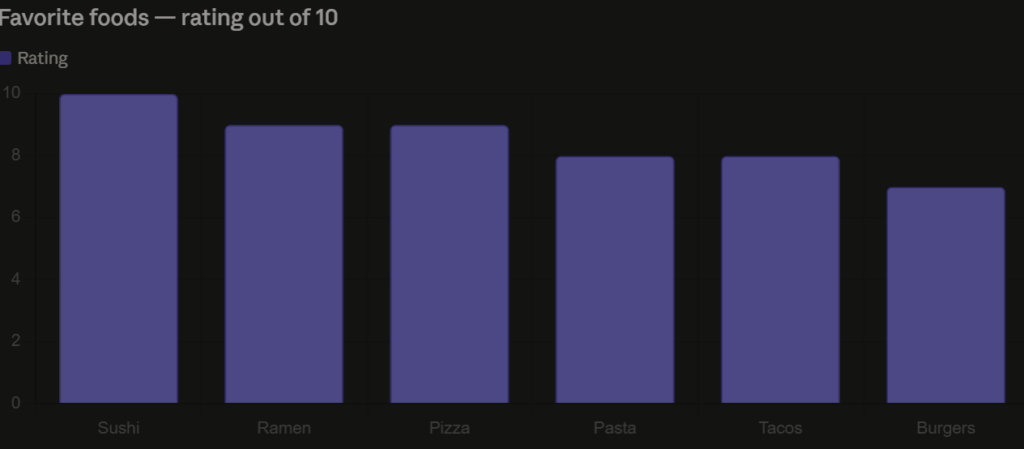
Favorite Foods — Rated Out of 10
I rated six of my favorite foods on a scale of 1 to 10. Sushi takes the top spot, no surprise there. Ramen and pizza tie for second. Simple bar chart, easy to read at a glance.
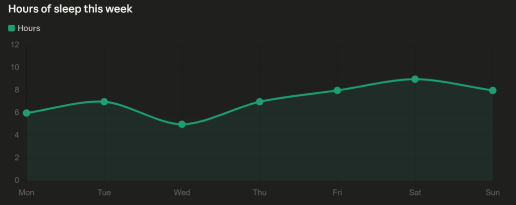
Sleep This Week
I tracked how many hours I slept each night from Monday to Sunday. Wednesday was rough at 5 hours, Saturday was the best at 9. The line chart makes the pattern obvious in a way a list of numbers wouldn’t.
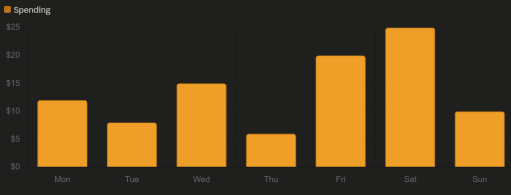
Daily food & coffee spending ($)
Reflection
Data visualization is its own form of multimedia. Each chart this week combined numbers, color, and spatial layout to communicate something faster than text alone could. That’s Mayer’s multimedia learning theory in practice — the visual channel and the verbal channel working together to reduce cognitive load.
Accessibility showed up in my chart choices. Bar and line charts are among the most universally readable formats.
Design thinking came into the selection process. Each dataset got a different chart type because each one told a different kind of story. Trends over time go to a line chart. Comparisons between categories go to a bar chart. The format should serve the data, not the other way around.
Active learning happened in the making. Deciding what to visualize, picking the right format, and thinking about what each chart actually communicates is a different kind of thinking than just reading about data viz in a textbook.
And storytelling is what ties all three together. A week of sleep, spending, and food preferences sounds boring as a list. As charts, it becomes a small portrait of a week in my life.
This week, I chose to step away from the DS106 Daily Creates and document three things from my own life, each one a multimedia artifact in its own right.
A Phone and a Dial Tone
I paired a photo of a phone with a dial tone audio clip. Simple combination, but it works — the sound adds a layer the image alone can’t capture.
FBLA State Business Competition — 2nd Place
I placed second at FBLA State in high school. To go with the photo, I added a winning sound — because a still image doesn’t quite capture what that moment felt like.
A Wardrobe I Built
I built a wardrobe and filmed the finished product — a walkthrough of the exterior and interior. Seeing it complete on video hits differently than a photo would.
Reflection
This week felt different because I chose the content myself. Each piece came from my actual life, not a prompt, which made the multimedia learning theory connections feel more natural. Combining audio, image, and video in one post is exactly what Mayer’s principles describe — using multiple channels to make meaning stick.
From an accessibility standpoint, pairing visuals with audio and written context means someone can engage with this post regardless of how they best process information.
Design thinking showed up in how I framed each item — not just “here’s a thing” but why it matters. The wardrobe and the FBLA result both required iteration and problem-solving to get there.
Active learning happened in the doing. Building something physical and competing at a high level are both forms of learning that no classroom replicates.
For my final multimedia story, I headed out to Miners Corner Park on a walk to spend some real time outside, slow down, and actually pay attention to what was around me. What started as a class assignment ended up being a genuinely good afternoon.
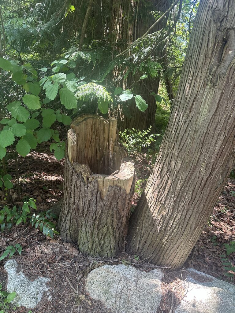
The Broken Tree
A little way in, I spotted a small broken tree right off the path. Something about it stood out to me. It is not dramatic or unusual, but it made me stop. Nature does not always look pristine, and I think there is something worth noticing about that.
The Walking Trail
This was my favourite part of the walk. The trail winds through some really nice greenery, and in the video, I talk about how peaceful it feels just walking through it. No traffic, no noise, just the path ahead. It is the kind of place that makes you wonder why you do not go outside more often.
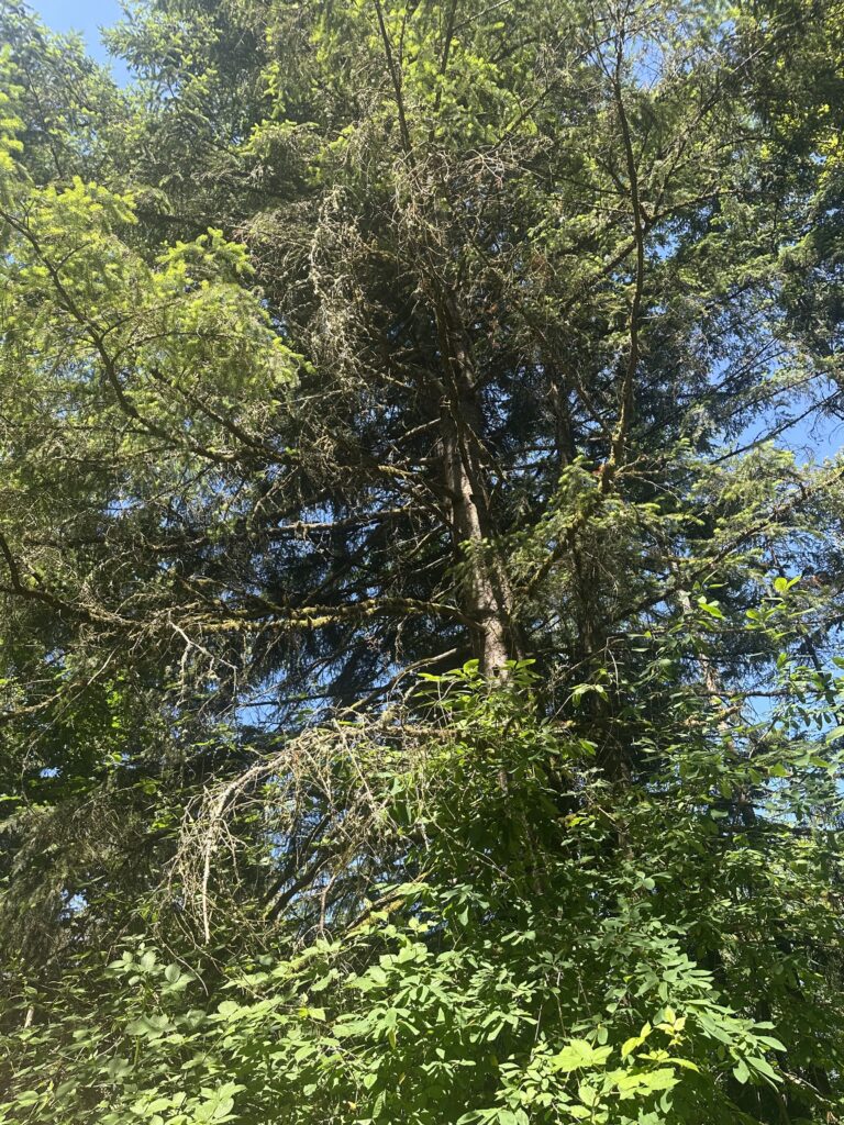
The Trees
Further down, I stopped to photograph one of the bigger trees. Looking up through the canopy with the sun cutting through the leaves is one of those things that looks even better in person than in a photo. But the photo still does the job.
The Wildflowers
Right near the trail edge, there was a small cluster of white wildflowers growing through the green. Easy to miss if you are moving fast. I almost did.
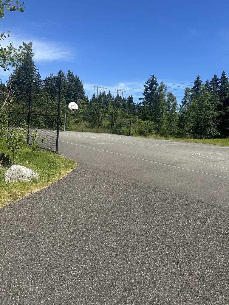
The Basketball Court
I did not expect to end up playing basketball, but here we are. There were a few people already on the court, and it just kind of happened. Honestly, one of the highlights of the whole afternoon. It added a social energy to the trip that the quieter parts of the trail did not have.
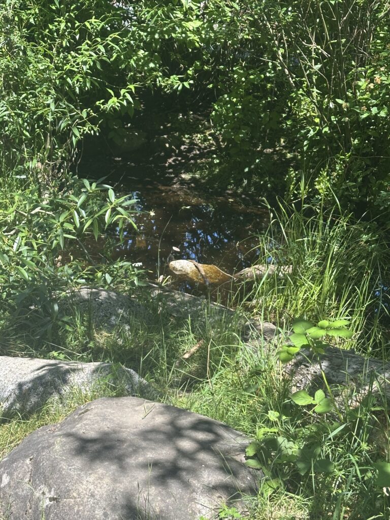
The Pond
Tucked toward the back of the park, there was a small pond. Quiet, still, and a nice contrast to the basketball court I had just left. I stayed here for a few minutes, just taking it in.
The Playground
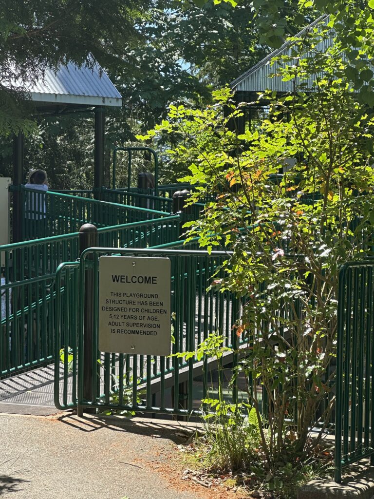
On the way back, I passed the playground. Empty in the afternoon, but it added to the feeling that this park is genuinely used and loved by the people around it. It is not just a patch of grass. It is a real community space.
Heading Home
In the last clip, I talk about heading out and what the afternoon felt like overall. It was a good time. More relaxed than I expected, more eventful than I planned, and honestly just a nice few hours outside.
How I Applied Mayer’s Principles
Modality — Instead of writing long blocks of text to describe what I saw, I let the videos carry the narration. Hearing me describe the trail while watching the footage uses both the verbal and visual channels at the same time, which is exactly what the modality principle is about. It reduces the load of reading while still delivering the same information.
Contiguity — Each photo and video is placed right next to the written description of that moment. The broken tree photo sits with the paragraph about the broken tree. The pond photo sits with the paragraph about the pond. Keeping related content together makes it easier to follow and connect.
Coherence — Everything in this post is there for a reason. I did not include every single photo I took or every moment from the afternoon. I kept the things that moved the story forward and cut anything that felt like filler. Less is more when it comes to keeping an audience engaged.
Segmenting — The story is broken into clear individual sections, one per location or moment. Rather than dumping everything into one long block, each section gives you a moment to land before moving to the next. This makes the whole thing easier to absorb without feeling overwhelmed.
Peer Feedback
A few people in my group felt the draft was solid but pointed out that Mayer’s principles section felt a bit surface-level and could go deeper with more specific examples tied to the actual media. They also suggested adding more personal reflection throughout the story rather than saving it all for the end. For the final, I made sure each Mayer principle was connected to a specific moment or media choice in the post, and I put more of my own thoughts and reactions into each section rather than just describing what I saw.
Process and Challenges
The biggest challenge was audio quality. Recording voice memos outside with wind and ambient noise is harder than it sounds. I ended up just talking directly into my phone close up rather than holding it at a distance, which helped a lot.
Editing decisions were also interesting. I had more footage than I needed and had to decide what actually added to the story versus what was just extra. The basketball moment was not in the original plan at all, but it ended up being one of the more genuine parts of the post, so I kept it.