This week I stepped away from the TDC prompts and visualized three things from my own life. No external research, just data I already knew.
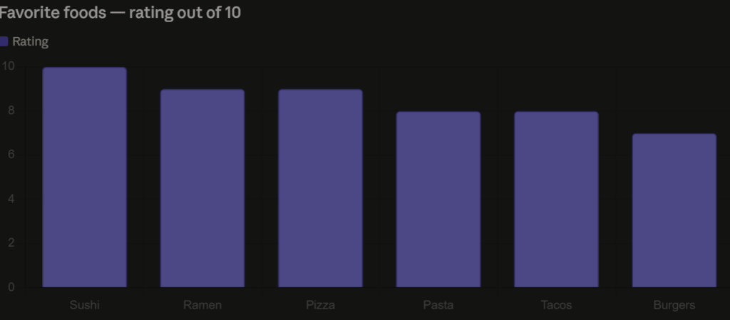
Favorite Foods — Rated Out of 10
I rated six of my favorite foods on a scale of 1 to 10. Sushi takes the top spot, no surprise there. Ramen and pizza tie for second. Simple bar chart, easy to read at a glance.
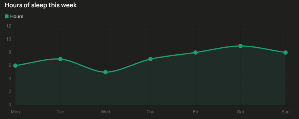
Sleep This Week
I tracked how many hours I slept each night from Monday to Sunday. Wednesday was rough at 5 hours, Saturday was the best at 9. The line chart makes the pattern obvious in a way a list of numbers wouldn’t.
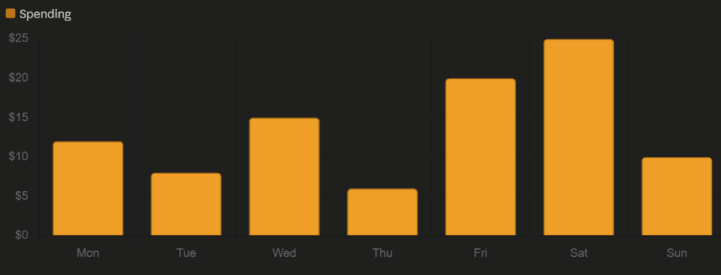
Daily food & coffee spending ($)
Reflection
Data visualization is its own form of multimedia. Each chart this week combined numbers, color, and spatial layout to communicate something faster than text alone could. That’s Mayer’s multimedia learning theory in practice — the visual channel and the verbal channel working together to reduce cognitive load.
Accessibility showed up in my chart choices. Bar and line charts are among the most universally readable formats.
Design thinking came into the selection process. Each dataset got a different chart type because each one told a different kind of story. Trends over time go to a line chart. Comparisons between categories go to a bar chart. The format should serve the data, not the other way around.
Active learning happened in the making. Deciding what to visualize, picking the right format, and thinking about what each chart actually communicates is a different kind of thinking than just reading about data viz in a textbook.
And storytelling is what ties all three together. A week of sleep, spending, and food preferences sounds boring as a list. As charts, it becomes a small portrait of a week in my life.